Method 2 is basically following the tightly packed height contours around the trough and ridge patterns.
- The basic steps for drawing a jet stream map, whether it is an analysis or a forecast model, can be broken down in easy steps.
- BUT REMEMBER: you don't have to be perfect. When you are drawing a jet stream map you are making "an idealized or simplified map". You are making a continuous line for something that, in reality, is not continuous and in fact can be displaced vertically.
- A good tip: if you are able, looping through several forecast hours will give you better sense how things are flowing.
- I also have a post with basic information on jet streams.
METHOD 2
Get the Level
- During cold seasons, the 300mb chart might be of better use, since the air is more cold and dense in the vicinity of the jet stream during the cool season.
- During the warm seasons, the 200mb can be used but anywhere in that range is good.
Basic Assumptions
Some simple assumptions between the jet stream and height contours:
- the jet stream follows the trough and ridge pattern and these can be found in the height contours
- more tightly packed height contours implies higher winds (higher "gradient").
As a matter of interest, I've identified the positions of the mean trough (dashed blacked lines) and mean ridge (herringbone or zig-zag line).
 |
| Image 2 |
What do tightly spaced height contours look like?
As stated above, Method 2, is basically following the tightly spaced height contours around the trough and ridge pattern. A quick look at what I mean by "tightly spaced" is see in Image 3.
I have placed red lines of equal length in the map. They are perpendicular to the height contours (the black curves lines). Areas where more height contours intersect the red line can be consider tightly spaced.
For example, Point A intersects five (5) height contours, while Point B and Point C intersect one (1) and three (3) height contours, respectively. You can see that the region around Point A has higher winds speeds (indicated by the blue shading and the wind barbs), while Point B and C have comparatively light winds. The higher winds speed locations are in areas where the "gradient" is higher.
A gradient is basically a rate of change over distance. In this case, heights changing more rapidly over a distance equates to higher wind speeds. Why? I will likely address that in a later blog.
Where the jet stream lays in this example is basically a relation of relatives. We want to follow the high contours where they are more tightly packed relative to other areas.
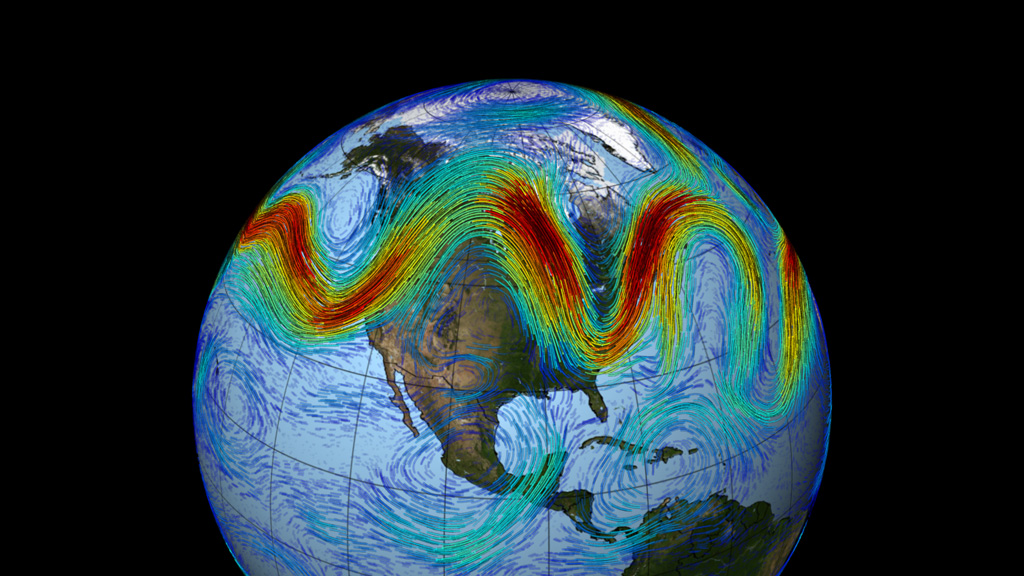
There are generally two (2) North American Jet Streams: the Polar Jet and the Sub-tropical Jet. When making weather maps for the general public, it may not be necessary to outline both but at least know they are there.
Pop Quiz: Of the three points (A, B and C) which has the lowest winds and why? Leave a comment to answer.
 |
| Image 3 |
Just draw the map already, Jeffrey!
So let's get to it.
In Image 1 and 2, we saw where the basic trough and ridge axis area lay. In Image 3, we've located one area of tightly packed contours (relative to areas where they are less tightly packed). So now we want to draw the jet stream.
Just draw a line that is parallel to the height contours, centered on the most tightly packed height contours. My result is in Image 4. The Polar Jet is indicated by the gold-toned line.
I could have also drawn the Sub-Tropical Jet. Where would you have drawn it? Leave a comment to answer.
 |
| Image 4 |
So that is it!
If you have any questions or comments, leave them below or send me a message.


